Chapter 5 Results
5.1 Distribution and outliers
5.1.1 Histogram for attributes
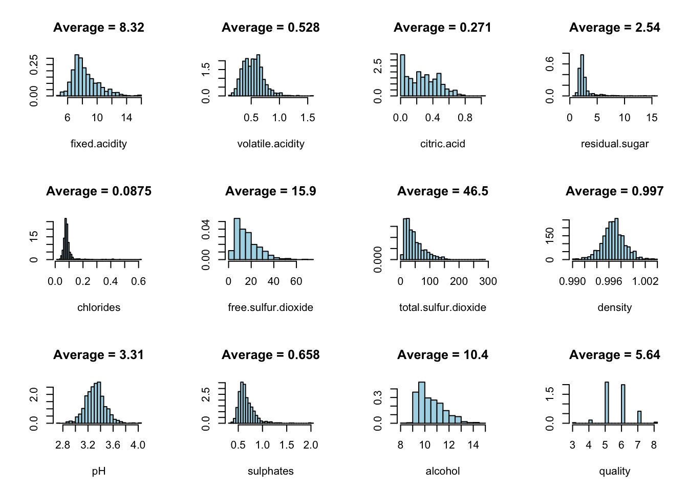
From the histogram, there are several things we observed:
Volatile acidity, density, and pH seem to be normally distributed.
Alcohol level, fixed acidity, free sulfur dioxide, sulphates, and total sulfur dioxide are right skewed.
Chlorides and residual sugar have relatively low variance.
Citric acid seems to have a plateau-shaped distribution.
Most wine has the quality of 5 and 6.
5.1.2 Boxplot for attributes
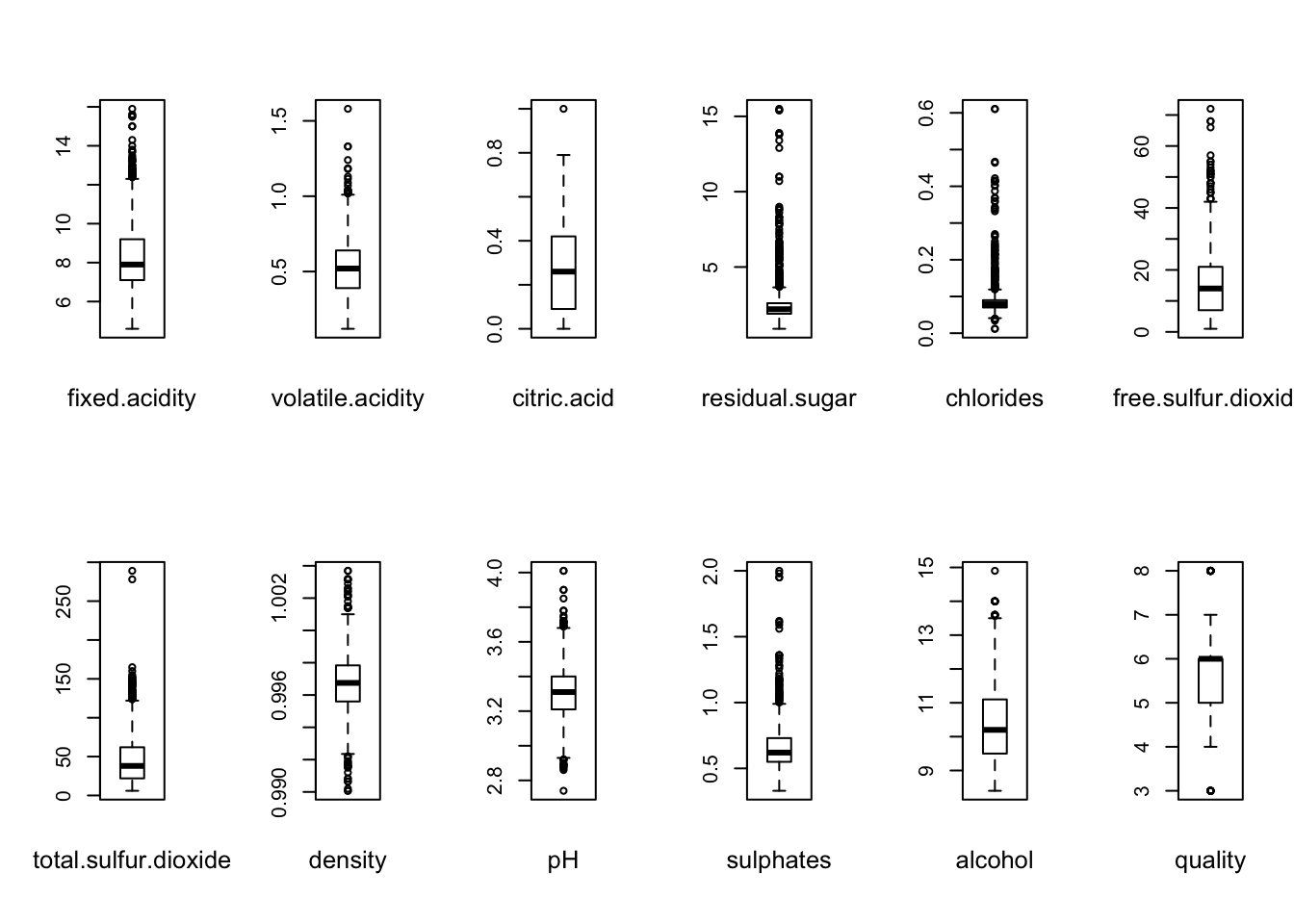
From the boxplot, there are several things we observed:
All the attributes have quite many outliers except citric.acid and alcohol. As less outliers might implies better distribution of the attribute data, we should keep an eye on those two columns with few outliers.
The median of our dependent variable - quality is 6.
5.2 Pairwise attribute correlation
5.2.1 Scatterplot matrix
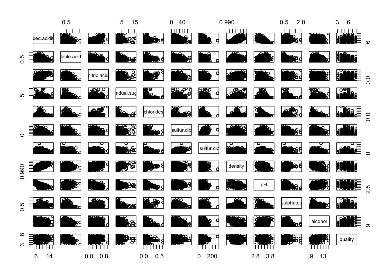
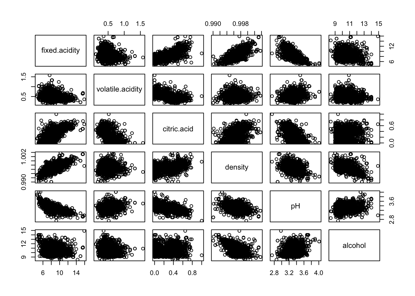
From the scattorplot matrix, we can observe that the following pairwise variables seem to have a linear correlation:
strong positive correlation: fixed acidity/citric acid, fixed acidity/density
strong negative correlation: fixed acidity/pH, density/alcohol
5.2.2 Correlation heatmap
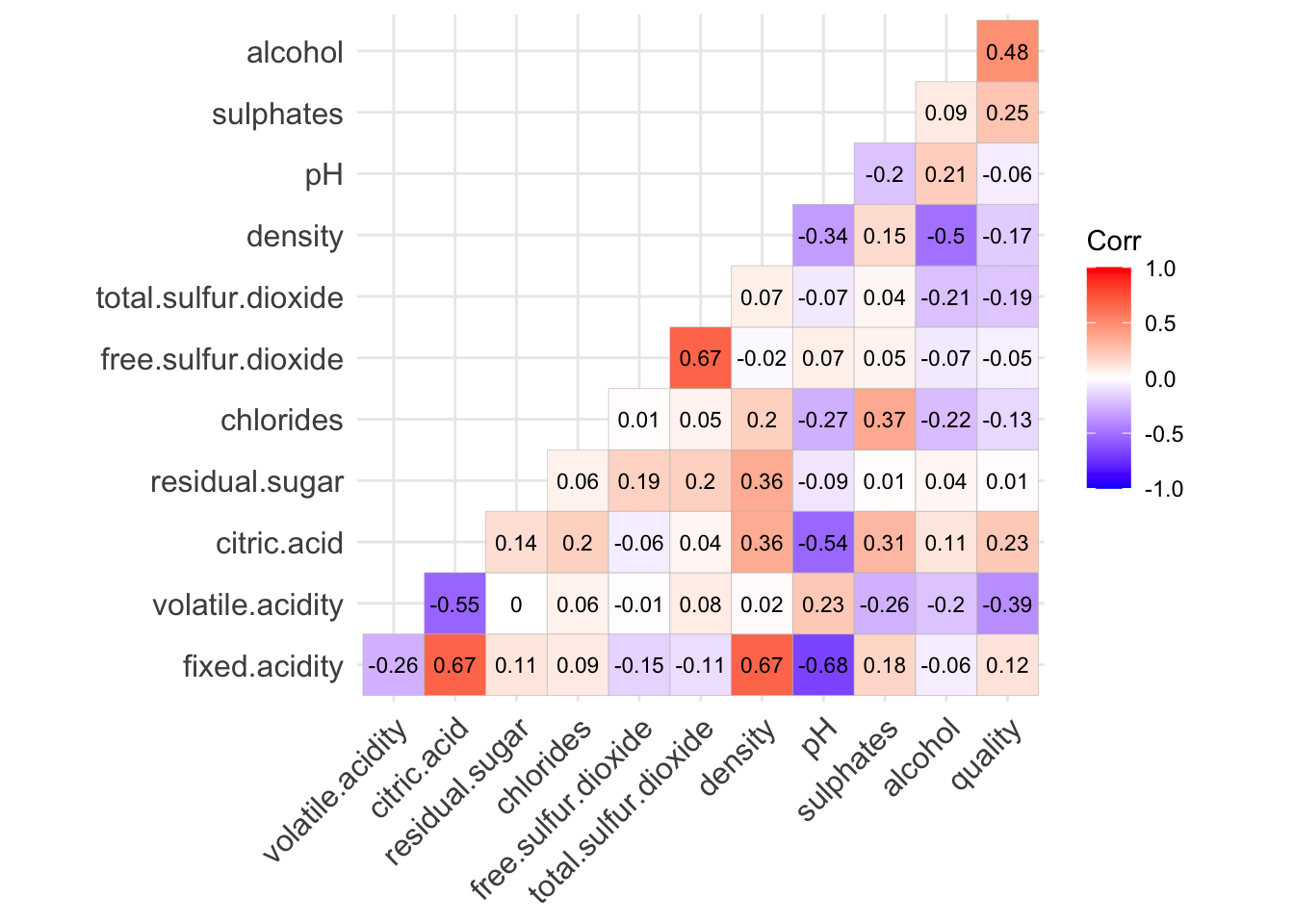
From the correlation heatmap, we again confirm the conclusion above
Three attributes fixed acidity, citric acid and density are closely positively correlated.
Fixed acidity/pH, density/alcohol have high negative correlation.
The observation is consistent with one of our conjectures: Sweeter red wine implies higher density and lower pH.
p.s. For further analysis or feature selection, we could cluster all these attributes into one group.
5.3 Correlation between quality and attributes
Recall the correlation heatmap, we can also tell attributes such as alcohol, citric acid and volatile acidity seem to have a linear correlation with quality.
5.3.1 Sweetness/sourness v.s. Quality
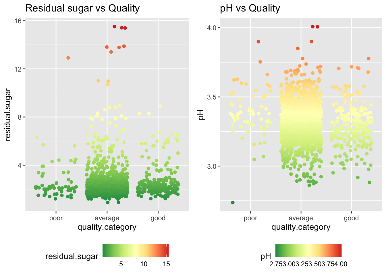
When rookies first drink red wine, it's much easier to taste the level of sweetness and acidity. This common sense is consistent with our scatterplot for residual sugar and volatile acidity versus quality.
- Residual sugar vs Quality
We can see that only red wines with quality on or below average have high and middle residual sugar, while red wines with good quality only have low residual sugar. So, we guess if the red wine you taste is very sweet , the quality of the red wine you drink is probably on or below average.
- Volatile acidity vs Quality
Observe that only red wines with quality on or below average has high pH. So, we carry out a conjecture that if you taste the red wine is very sour, the quality red wine you drink is probably on or below average.
However, we have to keep in mind that the scattorplot above doesn't generate any linear correlation between quality and sweetness or sourness.
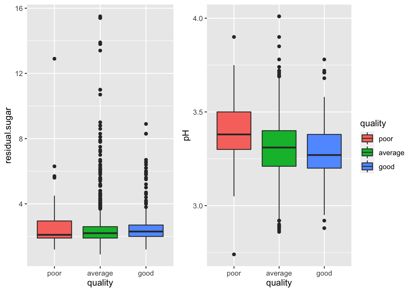
Now, from the boxplot above, we observe that neithe quality/residual sugar nor quality/pH have a linear correlation. That is, the sweetness or sourness is probably not the key attribute that affects the red wine quality most. This surprising observation does make sense, according to an article from Wine Enthusiast, the acidity and pH correlates to "how our mouth work" instead of the red wine quality per se. https://www.winemag.com/2019/06/19/what-is-acidity-in-wine/
5.3.2 Alcohol v.s. Quality
Now we shift the focus to another common and important attribute: alcohol.
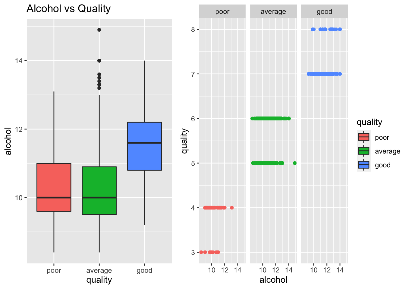
Alcohol has the strongest positive correlation with quality in our dataset. And from this graph, we can clearly see this relationship. Better wines have a high alcohol percentage. It is either because strong wines are more tasty or people who rates wines are wine lovers and they favor strong wines.
5.4 Pairwise attributes v.s. Quality
Then, let's study how the combination of two variables affects quality by looking at some multivariate graphs.
5.4.1 Alcohol + Volatile acidity
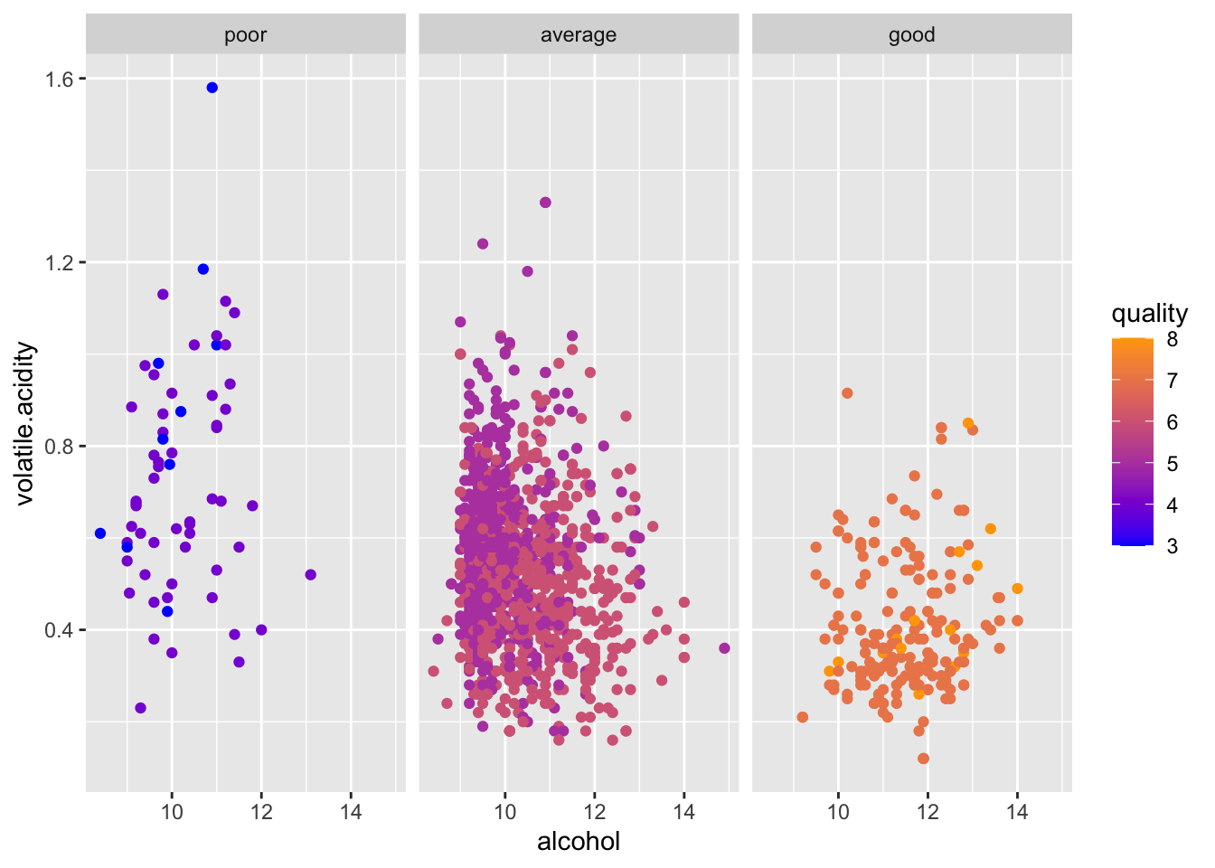
From the graph above, wee can see that good wines have higher alcohol and low volatile acidity levels than the other two groups with some outliers. The wine with the highest alcohol level scored only a 5 in quality. Also, the poor wines seem to have a dispersed distribution suggesting that people are consistent in the standards of good wines but inconsistent in the standards of poor wines.
5.4.2 Alcohol + Chlorides
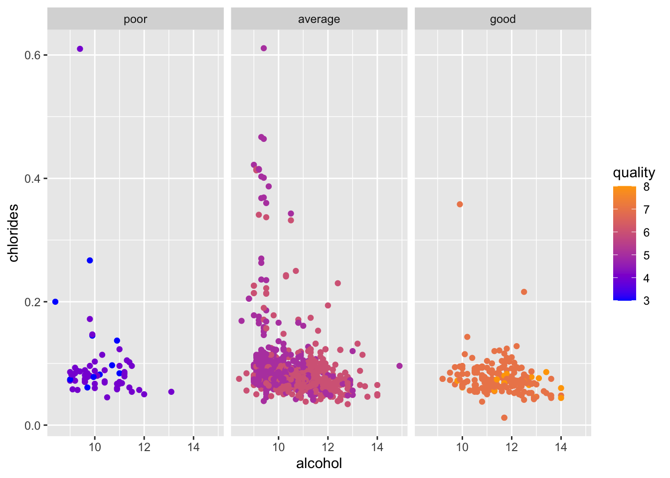
This graph is interesting because it shows that most wines that have high chlorides level are categorized as average wines. This pattern suggests that chlorides may have a non-linear relationship with quality.
5.4.3 Volatile Acidity + Chlorides
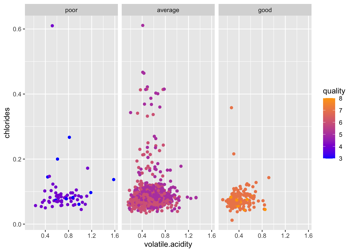
This graph supports our theory before that people have consistent standards of good wine and inconsistent standards of poor wines. Because all good wines are clustered in the lower left corner of the graph and poor wines have dispersed distribution.
5.5 Parallel coordinate plot for quality
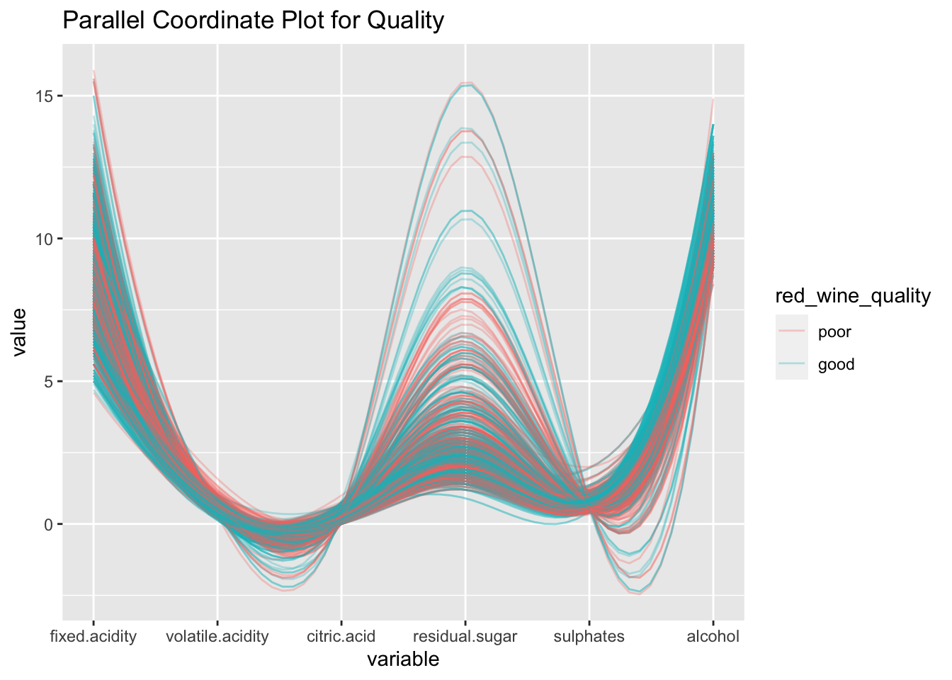
We factorize quality into two category: poor (0-5) and good (5-10) for a better visualization.
In this parallel coordinate plot, though the quality cluster is not very distinct, we can still observe some linear relations between different attributes:
positive trend between sulphates ans alcohol and, the alcohol of good wine is higher than the one of the poor cluster.
negative trend between fixed acidity and volatile acidity and most good wines have lower volatile acidity than the poor ones.